
Carel Tissue
Tools
Adobe Creative Suite
Techniques
Branding, Market Research Graphic Design
Process
Who was the client?
Carel Tissue Ltd. is Nigeria’s newest consumer packaged goods manufacturer. As a pharmacist, Ike Okoli had spent several years working right next to shelves stuffed with branded products, from toothpaste to tissue paper. And now, he was ready to place a product of his own on those shelves.
Why did they need my help?
Ike was looking to bring a consumer-packaged-goods brand to life. He needed someone who could anticipate screen printing expenses, and design a luxurious toilet paper under the constraints of a frugal color-scheme. The profit margin in any consumer packaged good is measured in just pennies. Every cost saving measure matters.
As a growing urban economy, the shelf space in Nigerian drugstores, grocery stores, and bodegas was expanding. Carel Tissue would have to challenge the handful of major brands in Nigeria that already had their foot in the door.
Unlike many hygiene essentials, most toilet paper doesn’t inspire brand loyalty. Most people don’t even notice it, until it runs out. The challenge was to make Carel Tissue into an appealing impulse buy that wouldn’t go unnoticed on the shelf.
How did I help them?
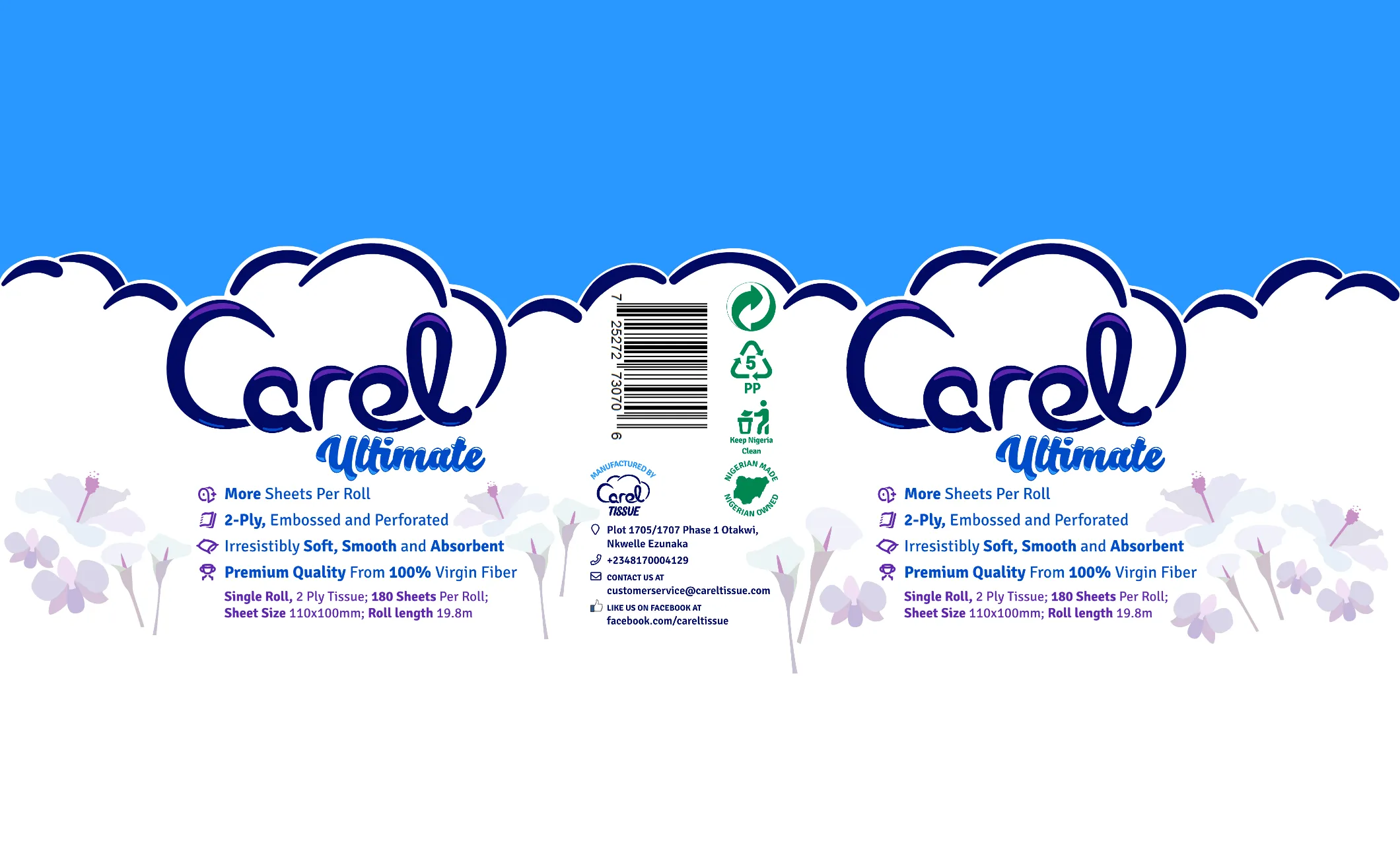
To start, I did some competitor research on the relevant brands with an expedition to the paper products aisle at a local pharmacy. (I attracted several raised eyebrows as I took extensive measurements and photos of toilet paper.) I collected a detailed, formulaic description of every item in the product family. Using the popular Nigerian e-commerce marketplace, Jumia, to compare the local offerings to their foreign counterparts helped extensively. The local US brands tended to rely on mascots: from the Charmin bear, to the Angelsoft baby. However, the Nigerian brands featured more botanical motifs.
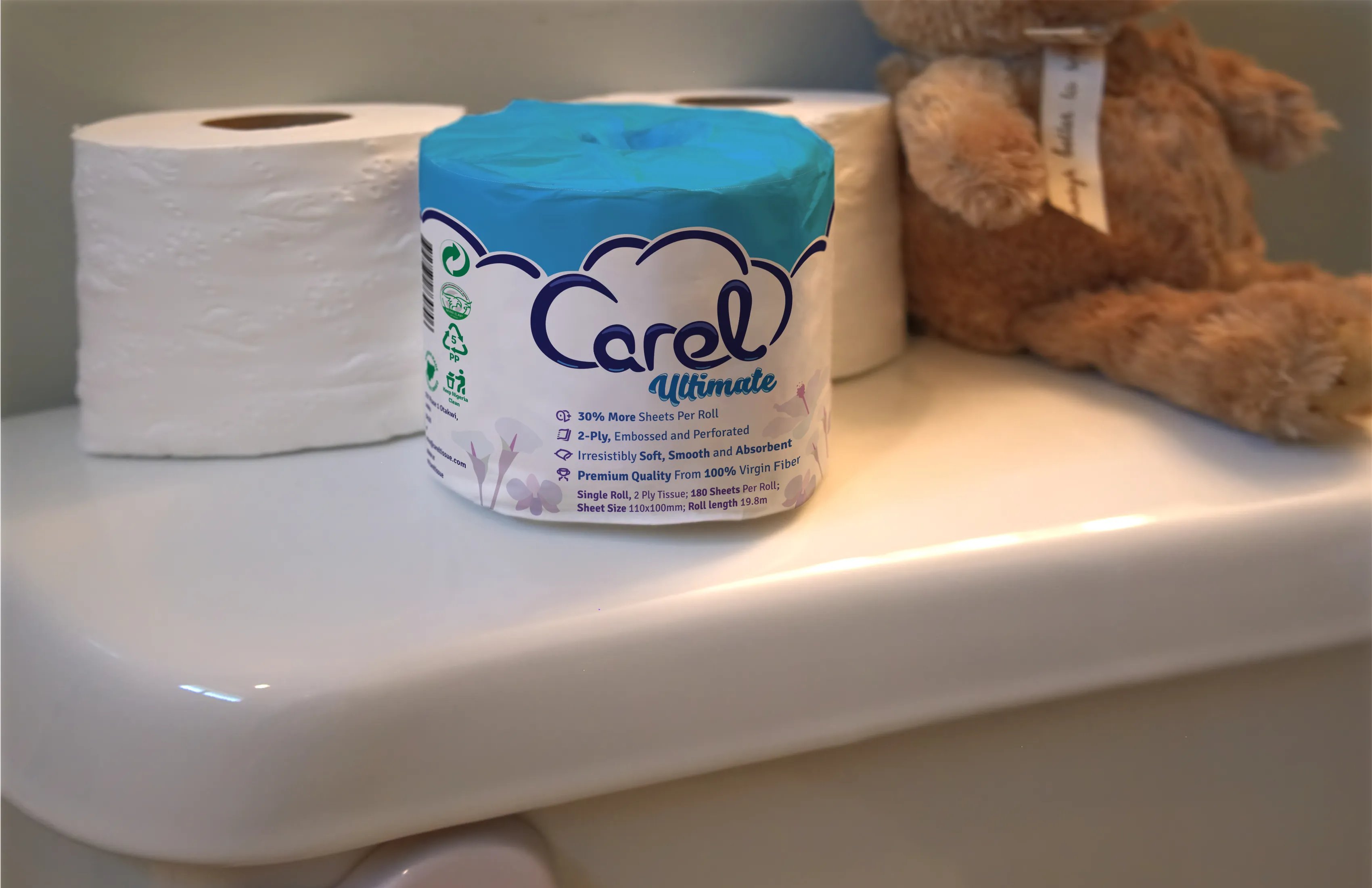
So, what could this information tell us about product packaging that sells? First off, it has to convey the sensory experience the shopper will have as soon as they unwrap the product. the way people shop for toilet paper more closely resembles the way that they shop for fresh produce: the majority tend to grab the nearest roll that looks like it would provide the most pleasant experience. As such, the packaging on a roll of toilet paper functions like the peel of a fruit: the more appealing it looks, the better people will assume it feels.
In this case, it also had to demonstrate cultural competency. That means that it has to communicate with visual motifs that are familiar to the buyer, and avoid imagery that could be perceived as offensive or off-putting in the international market.
Colors, shapes and symbols that connote purity and cleanliness in one culture might not translate to another. I took extra care to utilize universal symbols. Everyone is familiar with clouds, regardless of where they are in the world. Nothing connotes softness, absorbency and purity more consistently across cultures than a fluffy, white cloud. Likewise, tropical flowers, such as orchids and Calla lilies which are native to Africa, exist across the globe.
What were the results?
When the packaging was finally printed, the toilet paper practically leapt off the shelf. Ike has since opened a factory in Onitsha, the manufacturing hub of Anambra State, Nigeria. He was able to own and operate a Covid-proof business in 2020's pandemic-toilet-paper-panic. This last year, he partnered with Divstar Services Ltd, a distributor who sells Carel Tissue throughout Rivers State, the 6th most populous state in Nigeria.